
Statistical genetics for all occasions
The unexpected election of Donald Trump as the next President of the United States has generated an avalanche of articles and social media posts attempting to explain what went wrong and why the pre-election predictions were so off. This event seems of a piece with the earlier similarly unexpected (based on polling) votes for Britain to leave the EU and Colombia to scuttle the peace deal with the FARC guerrillas. Much of the commentary has thus been focused on explaining the poll failure and on the possible motivations of Trump voters. Commentators typically use exit polls and percentages of the vote won by the candidates to bolster their arguments. When we look at the fraction of votes received, however, we are looking at a ratio of two quantities. Changing either the numerator or the denominator can change the value of the ratio. Might a separate examination of the changes in the number of votes won by each party tell us something about what happened? I started thinking about this after one of my friends shared a Twitter post comparing the Democratic turnout in the three latest elections. This quick analysis only looked at aggregate national numbers, an approach that likely obscures important patterns.
I decided to see what can be learned from looking at how the turnout of Democrats and Republicans has changed from the 2008 election. I chose 2008 as a baseline because that election was relatively recent, and so the overall size of the electorate has not changed much. On top of that, turnout was particularly strong in 2008. This is useful because this set of voters probably represents the maximum realistically attainable pool (at least for Democrats). I downloaded official vote count data for the 2008 and 2012 elections from here and here. Official numbers are not available for 2016 yet, so I got the most recent counts from here. I doubt that these will change enough to be noticeable on the plots I present below. To meaningfully compare vote counts, I calculated percent deviations in ballots cast from the 2008 numbers. The annotated R script I wrote to analyze and plot the data, as well as the data themselves and all the results, can be downloaded from here.
I first checked the original observations that spurred this exercise by plotting the national aggregate deviations. I see the same pattern:
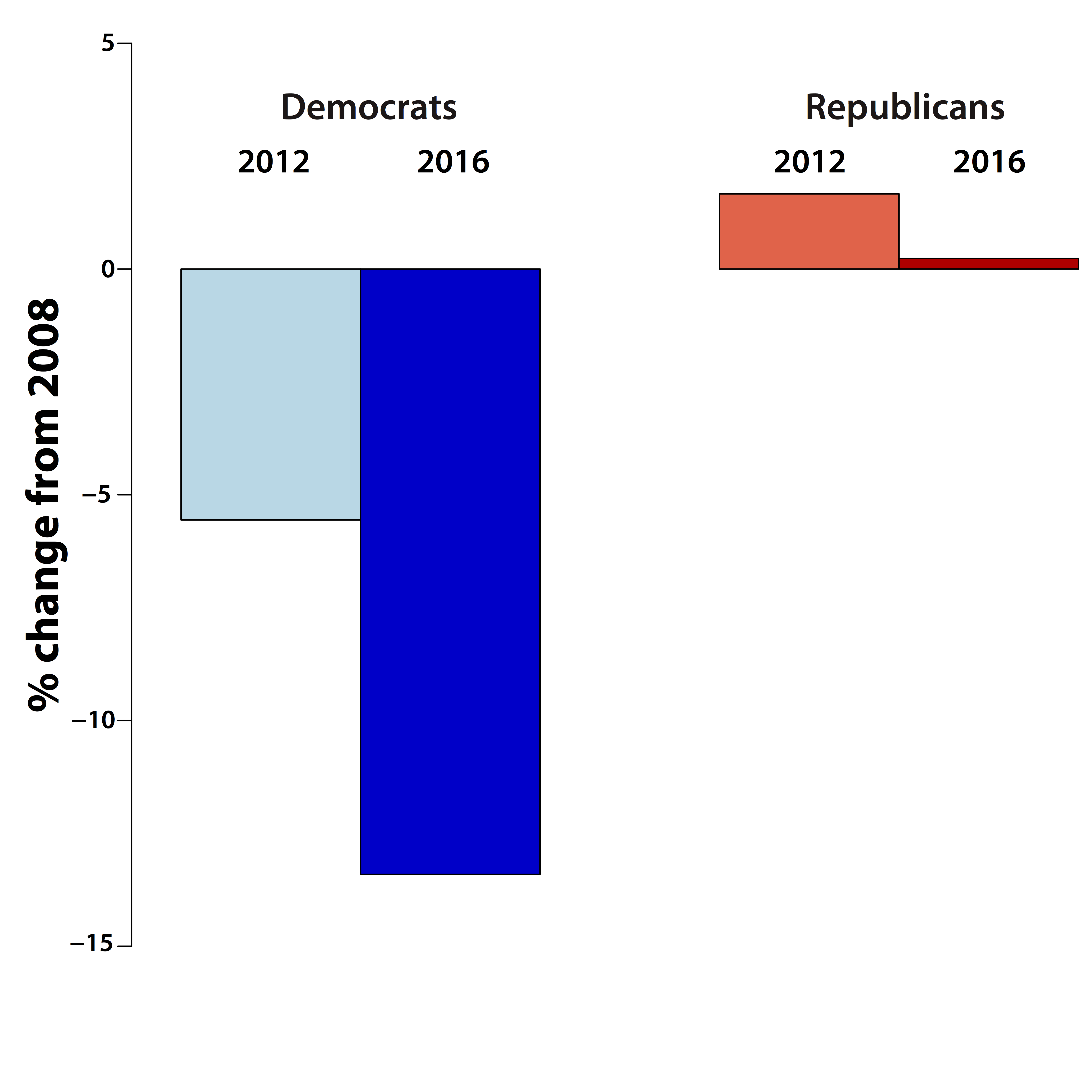
It really does seem like the Democratic turnout this year significantly dropped even from the 2012 levels, while Republicans voted in similar numbers each of these years. How does this pattern vary from state to state? Here are the results with each party plotted separately:
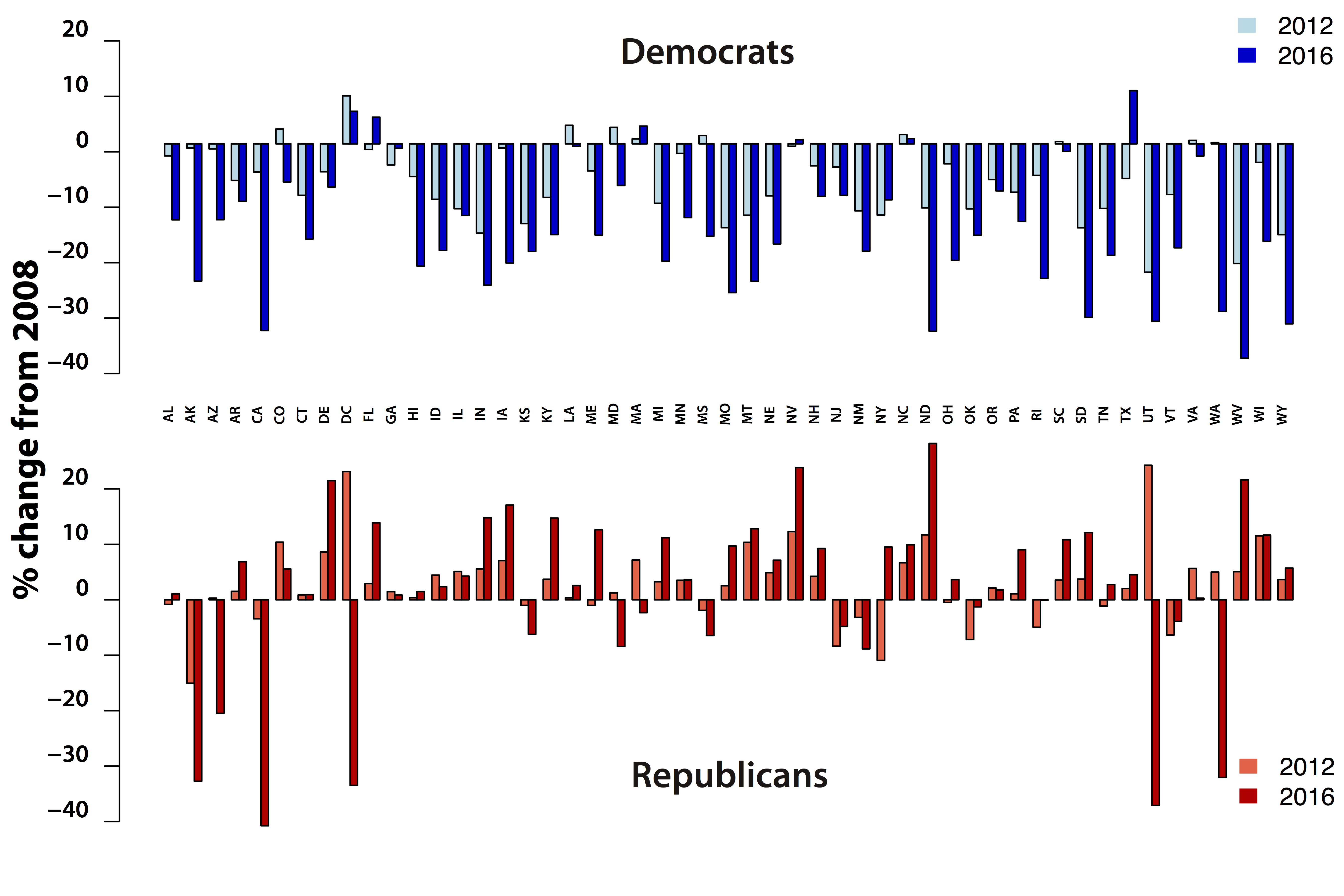
On the Democratic side the national trend is reflected in the state results, but there are important deviations. The states that bucked the national trend seem to have large hispanic populations (Nevada), are located in the South (South Carolina, Louisiana) or both (Florida, Texas, North Carolina). I do not know enough about the demographic composition of these states to make any deeper observations, but it would be interesting to find out what is special about them. These numbers suggest that the predominant post-election conversation that focuses on the identity and motivations of the Trump voter are missing an important part of the story. Did the vaunted Clinton get-out-the-vote (GOTV) operation fail or did it manage to prevent an even larger collapse? My analyses cannot answer this question, but we can get some hints. As I mentioned, some Southern states, where the GOTV effort was probably not as active as in the battlegrounds, nevertheless bucked the trend in reduced turnout. This suggests that GOTV may not have had much of an effect. We can also look at the distributions of turnout change in “red”, “blue” and “purple” (swing) states. Here is the plot (it is a box-plot; instructions on how to read it can be found here):
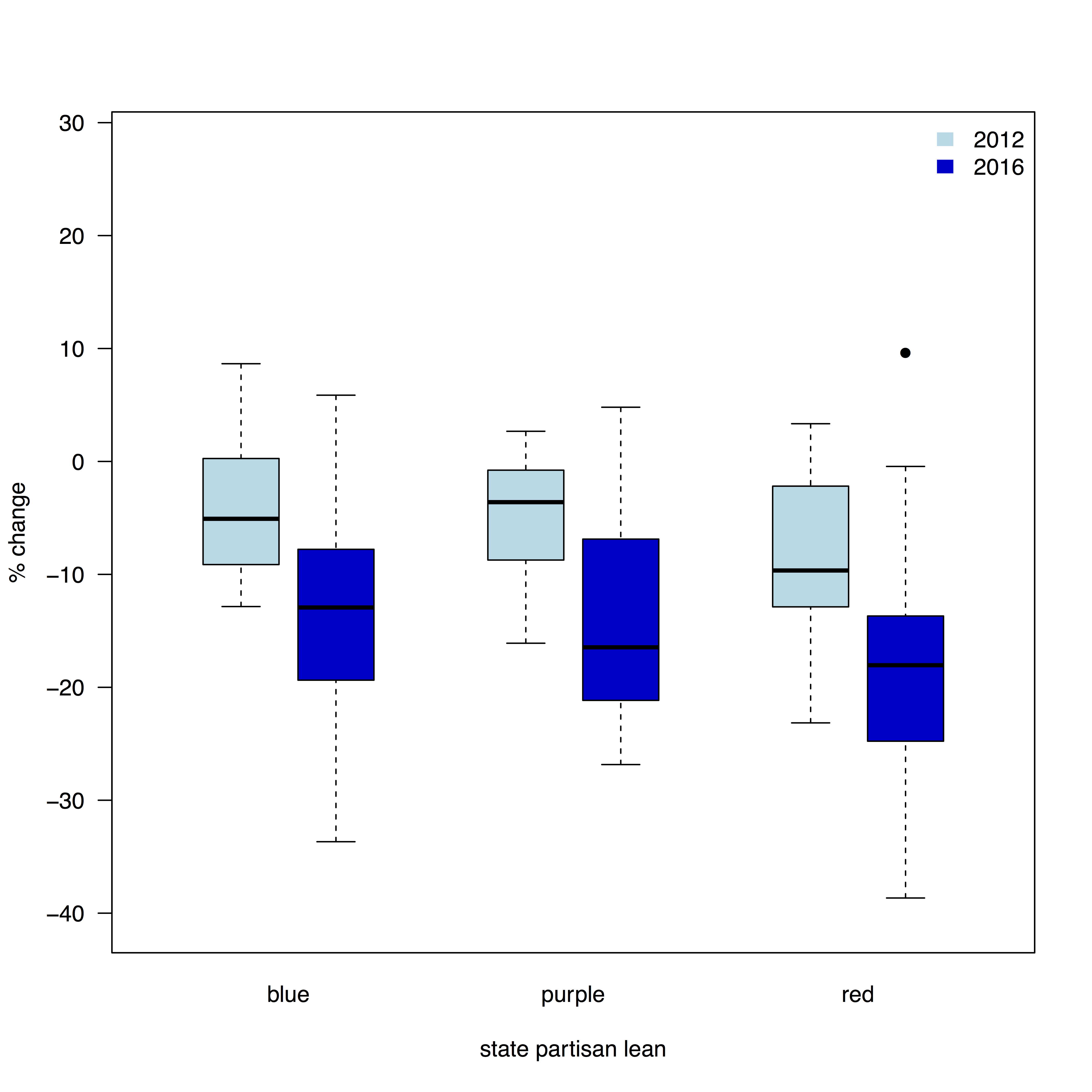
One would expect that the purple states have received more GOTV attention than the reliably red and blue ones. However, there is no difference in turnout among these groups. This simple analysis is of course far from definitive, but maybe it is worth re-examining critically the effectiveness of this campaign tactic.
Another possible explanation of the drop-off of the Democratic participation is the new voter ID requirements passed by a number of states. There are credible reasons to think that these disproportionally affect reliable Democratic voters such as minorities and students. I found data on voter ID requirements on the BallotPedia website, where the terms listed in the plot below are explained. Here is the plot:
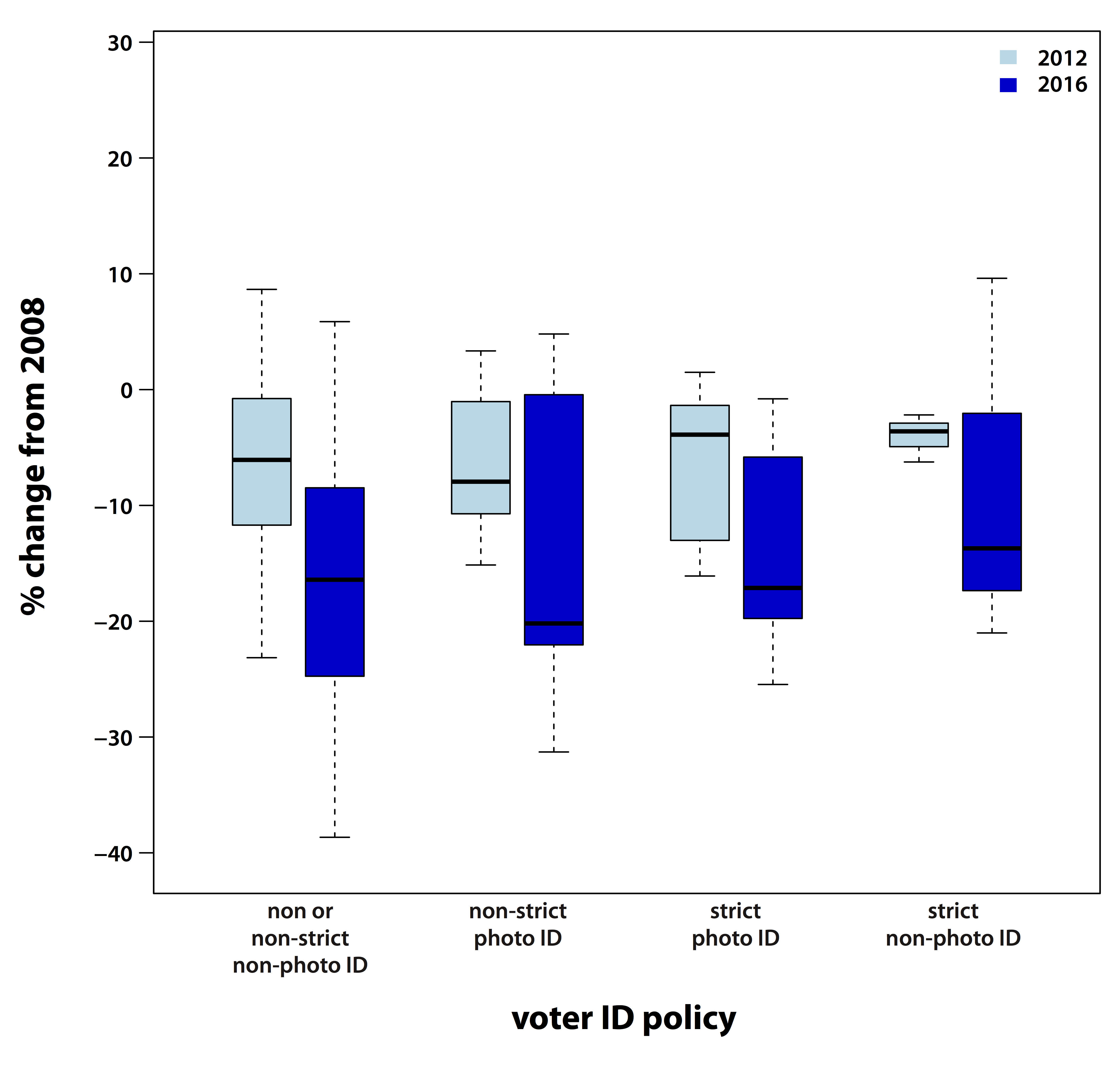
There does not seem to be any meaningful difference among states grouped according to voter ID requirements. This, again, is not the definitive analysis, but it does suggest that if these laws have an effect it is subtle and is not a big contributor to the 2016 election result. Perhaps precinct-level analyses would uncover some contribution of voter ID requirements, especially where they are accompanied by closures of voting places in affected communities.
While the pattern among Democrats is relatively simple, the nation-wide result for Republicans hides considerable heterogeneity. The clear increase in turnout in many Midwestern and other states affected by de-industrialization (West Virginia, for example) is offset by big drops in deep-blue states like California. An interesting outlier is Utah, where there was a credible third-party challenge from Evan McMullin. It does appear that Trump brought in some additional voters in crucial battle-ground states, despite his reportedly shambolic GOTV efforts. Understanding the motivations of these voters is important. There are two major schools of thought on this topic: the “economic anxiety” and “pure bigotry” camps. I do not claim that my analyses here can settle this debate. That said, some arguments can be examined in light of the patterns I see. For example, an interesting argument against the “pure bigotry” hypothesis was advanced by Tim Carney:
This seems persuasive at first glance, but Trump’s win in Pennsylvania came as a result of fewer Democrats showing up to vote and some new Republican voters making it to the polls. Now, it is possible that the people who voted for Obama in 2008 are the same people who are now in Trump’s column. But the same result could have come about without anyone changing their mind about Obama. Those voting Republican this year may not be the same people who voted for Obama in 2008 despite the impression one gets from looking net shift in vote share. In other states, such as Ohio, the difference was entirely due to the drop in the number of Democrats. Carney’s argument does not seem dispositive.
The glaring failure of polling-based predictions should lead to a re-examination of the methods we use to study what motivates voters. Analyses of actual votes cast can be a promising tool. Even a quick and simple look at these data uncovers some interesting patterns that provide a check on the developing conventional wisdom about the forces that brought Trump to power. Anemic turnout of Democrats in mid-term elections has been widely discussed. It seems like the party has a bigger problem on their hands and has to develop a strategy to overcome this obstacle if they are to return to winning elections.